Examples library
Tooltip
Guide users through your app by anchoring contextual tooltips to UI elements
Tooltip example application - Flows
Add contextual in-app tooltips to your app and guide users to the features that matter most. This example uses the built-in Tooltip component from @flows/react-components to anchor floating tooltip steps to specific UI elements using CSS selectors - no custom component code required.
Tooltip-based tours are one of the most effective ways to drive feature adoption and reduce time-to-value. Because each tooltip points directly at the relevant element, users get hands-on context exactly where they need it, rather than reading static documentation.
Features
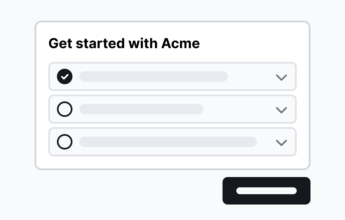
The workflow in this example walks users through an analytics dashboard in four steps:
- Stats row - Draws attention to the KPI cards at the top of the page and explains what each metric represents.
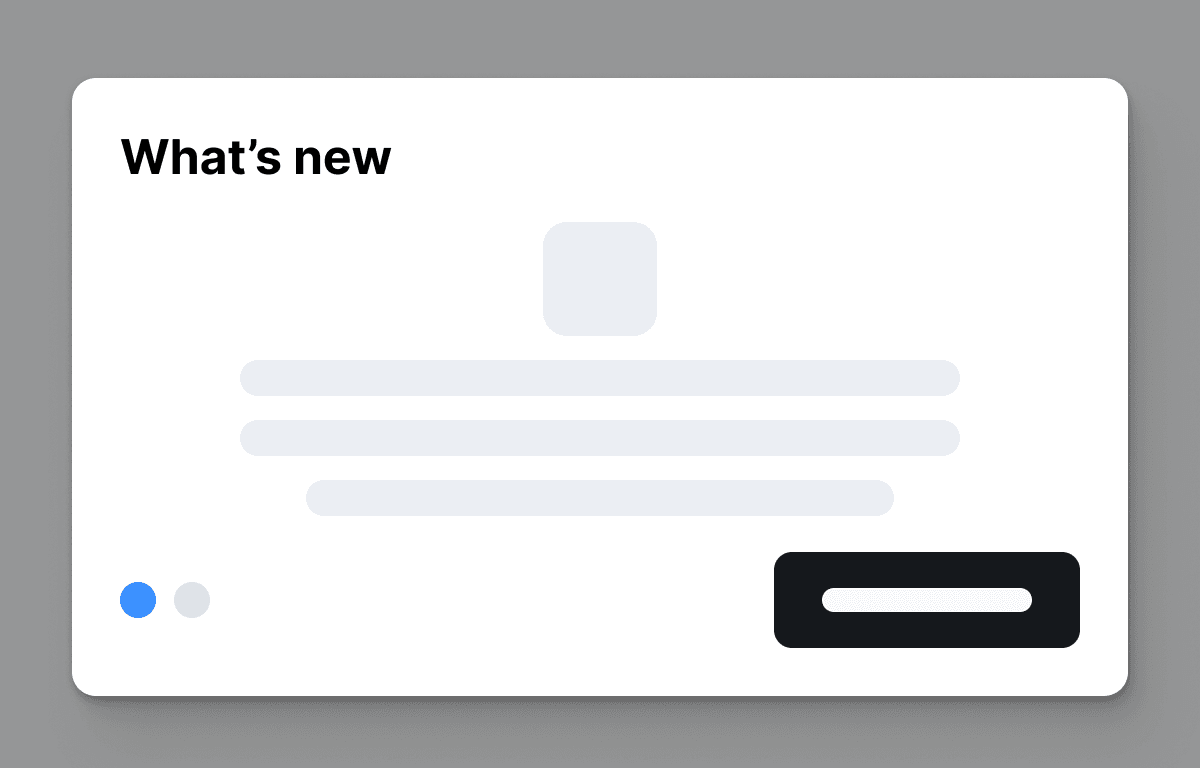
- Main chart - Anchors a tooltip to the visitors-over-time chart and explains how to interpret trends.
- Top pages - Highlights the top-pages panel so users know where to find page-level breakdowns.
- Create report button - Ends the tour by pointing users to the primary action so they can act on what they just learned.
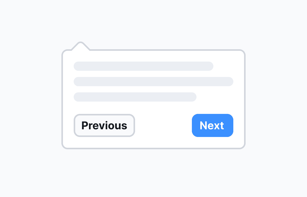
Each step is a BasicsV2Tooltip block from @flows/react-components/tour. The block targets an element by CSS selector, positions the floating tooltip on the correct side, and advances the workflow when the user clicks Next. Users can also dismiss the tour at any time via the close button. No custom components are needed - the entire tour runs on Flows built-in UI.
Below is a screenshot of how the workflow is set up in Flows:

When to use in-app tooltips
Contextual tooltips work best when you want to call attention to a specific UI element without interrupting the user's workflow. Common use cases include:
- Onboarding new users to an unfamiliar dashboard or feature set.
- Announcing a new feature by pointing directly to it in context.
- Guiding users through a multi-step workflow for the first time.
- Re-engaging returning users after a redesign or navigation change.
- Reducing support tickets by explaining non-obvious UI patterns in place.
Getting started
- Sign up for Flows if you haven't already. You can create a free account here.
- Clone the repository from GitHub and install the required dependencies in the project directory.
- Add your organization ID in the providers.tsx file.
- Recreate the tooltip tour workflow using the built-in Tooltip block. Target the element IDs from home.tsx: #stats-row, #main-chart, #top-pages, and #create-report-button.
- Run the development server with pnpm dev.
Learn more
To learn more about Flows take a look at the following resources:
Framework
Next.js
Tags
Explore more examples
Build anything with Flows
Build the product adoption experiences you've always wanted.
No credit card required. Free forever.